
These guidelines outline how to use the Notiqoo brand elements consistently.
Typography
Our typestyles consist of headline styles and a paragraph style. We use two font families: Inter Variable for headings and Montserrat for body text. This combination ensures strong hierarchy and optimal legibility across all brand materials.
Headlines
We always use Inter Variable for headline styles, as it’s our primary typeface. All headlines are written in uppercase and categorized into Black, Primary, and Secondary styles depending on use.
Black Headline
Used for short, impactful statements like taglines.
Typeface: Inter Variable
Font-weight: Black
Primary Headline
Applied to all standard headings across designs.
Typeface: Inter Variable
Font-weight: SemiBold
Secondary Headline
Used alongside the primary headline for visual layering.
Typeface: Montserrat
Font-weight: Bold or ExtraBold
Paragraphs
For paragraph text, we use Montserrat for its clean readability. This font applies to all supporting or descriptive content throughout the brand.
Logo Usage
The Notiqoo logo combines an icon and wordmark. It must always be presented clearly and consistently. Do not modify, distort, or separate the elements.
Small Logo
For sizes below 100px width, use the small logo with optimized spacing and kerning. This ensures better legibility at compact dimensions.
Clear Space
Maintain breathing space around the logo using the letter ‘o’ from Notiqoo. Rotate it 90 degrees and duplicate it to define spacing on all sides of the logo.
Icon: Message
The Message icon is our standalone brand mark and can be used independently in tight spaces. Prefer using it in our Dark Slate Blue color. Other versions are permitted depending on background needs.
Icon Usage Hierarchy
Lavender Icon on Dark Slate Blue background (Preferred)
Dark Slate Blue Icon on White background (To be used when option one is not working out)
White Icon on Black background(Whenever incorporating Dark slate blue is not an option, our preferred option is a white version of Icon on a black background)
Black Icon on White background ( Used when a white version of Icon is not working …Least preferred)
Brand Colors
Our color palette reinforces the Notiqoo identity. These colors should be used consistently across all platforms — including UI elements, backgrounds, icons, and text — to maintain brand recognition and clarity.
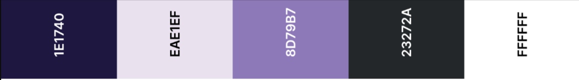
Dark Slate Blue
Hex: #1E1740
RGB: 30, 23, 64
CMYK: 96, 96, 42, 49
Usage: Core brand color. Use for backgrounds, headings, buttons, and key interactive elements.
Lavender
Hex: #EAE1EF
RGB: 234, 225, 239
CMYK: 6, 11, 0, 0
Usage: Used for icon backgrounds, message indicators, or gentle highlights.
Lavender Purple
Hex: #8D79B7
RGB: 141, 121, 183
CMYK: 48, 56, 0, 0
Usage: Accent color for buttons, UI cards, or hover effects.
Black
Hex: #23272A
RGB: 35, 39, 42
CMYK: 35, 0, 0, 100
Usage: Strong neutral tone. Use for text, icons, or when blue is not suitable.
White
Hex: #FFFFFF
RGB: 255, 255, 255
CMYK: 0, 0, 0, 0
Usage: Clean backgrounds and as a contrast base for brand colors.